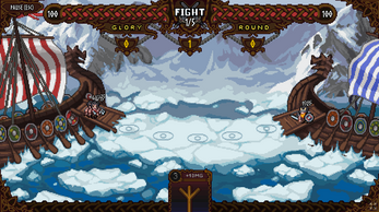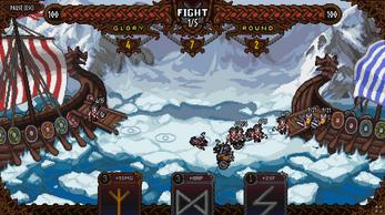
For Odin! For Glory!
Created in 5 days for Chill jam.
Once a decade, the best warriors of the north board dragonboats and gather in the sea around the sacred glacier. They are fighting for Odin and for Glory, and only one ship will return to shore.
- 5 classes of warriors!
- 5 levels with different gameplay!
- 10 maps, including maps with rotation!
---
Control and features:
Esc — pause, tutor
LMB — drag and drop the card
RMB — rotate the card (if it posible)
Golden Card — unlimited zone effect
Silver Card — instance zone effect
Move the card to the battlefield so that the zone gets an effect
Effects can be updated, and some cards can be rotated to get the opposite effect
---
Known bugs and flaws:
---
| Status | Prototype |
| Platforms | HTML5 |
| Rating | Rated 2.9 out of 5 stars (7 total ratings) |
| Authors | NewGameStudio, Fearawl, Rogotch, vfd11 |
| Genre | Card Game |
| Tags | 2D, Atmospheric, auto-battle, Pixel Art, vikings |


Comments
Log in with itch.io to leave a comment.
This entry looks and feels like a prototype or demo for a future indie game. Music is good, gfx is excellent, nearly no bugs (I also encountered the music bug). I don't play auto battlers so I wasn't sure what should I do, or how I can influence the outcome of the battle, but after a couple of tries I got the basics and won a couple of battles. It may be this genre's quirk, but I feel more explanation is needed to better understand the mechanics. There were some issues I faced when playing: the overlapping dmg/hp over the characters' heads. That first I didn't know which side is mine. What speed is (attack, walk, or both)? Am I able to control which class of warriors I will send to battle next? On top of my head, these. :)
I think you could turn this into a bigger project with adding a good tutorial and developing the idea further. Great work, one of my favorites from the jam.
Thanks!
cool game! loved the art
Love the game. Very difficult but challenging!
I honestly would love to see it developed more. Add upgrades and abilities to bring cards into your deck. Upgrade units. Change boats. Add defenses. So much to add to a game like this that could make it beyond amazing.
thanks. this is what you want to hear when you make a game
i watched the video. Found a lot of things that are not clear to the player. for example the learning menu hidden in the pause is a bad idea
There's definetely some areas that can be improved for the ease of the player. Maybe a controls scheme pops up when you press start so the player can review it and then get started. Or a small tutorial mission before the real battles begin. These make it easier for the player. It took me a little, as you saw, to realize that gold meant an area.
Still very good. Would love to see how you build on it
Hello NewGameStudio, I'm looking for some contacts for comunicate with you, maybe an e-mail or discord. If is possibile can touch with you? I have something about a game. I see your game viking and I have a game similar with a publisher potencialy interested it but I need some team member. Please contact me if is possible
mauroemme90@gmail.com
Here is the average games enjoyer opinion)
GAMEPLAY
- here is a lack of tutorial, which introduces main mechanics and controls for player clearly
- it is not obvious, which of two opposite crews you are playing for
- it is not clear, what the unit classes are
- it is not clear, how these classes differ from each other
- here is a lack of a short description of the effect of the card being played
- when the card is being played, unit stats's changes should be indicated with animations, to make player clearly understand how his choise affected the gameplay
(for example: short-timed highlighting of the changed value)
UX\UI
- upper ship's healthbar is covered by ornament too much, so it becomes hard to check the health value quickly
(for exmple: make the ornament's turns less frequent/increase the ornament's opacity/move it to the healthbar's background)
- move the GLORY points counter separately, because it is hard to differ among other upper less gameplay-important counters
- unit's DAMAGE/HEALTH values aren't highlighted and hard to keep in attention
(for example: make the DAMAGE/HEALTH panel above the unit and highlight it with colors)
- in the pause menu, there are SFX/Music sliders' icons are placed wrong.
The slider, which has a note icon, changes the SFX loudness, but not the Music loudness
DEFECTS
- rightside ship's bottom pixels are getting through icebergs
- when the card is being played, the sound of the anvil clanging is too loud
BENEFITS
- the musinc and other sounds are pleasant
- the design and color palette are very pleasant too
- the right atmosphere is created successfully
thank you very much, very detailed. this is just what we needed. I hope we choose this game for release on steam and use these tips
What do you think about the commercial success on Steam? such a game has the potential for further development?
Yeah, it really has. I guess, this game would be better to increase gameplay mechanics list. Also, here better be some reasons to make player don't stop playing, such as gameworld story or any kind of gameplay opportunities for progress.
Thanks! I will try to make it.
Awesome game, love the art, sfx, and the itch page! Also really cool usage of the upside down theme ;)
Thanks for joining the jam!
Thanks!
Sound and art seem really good to me! When I lose or win, I think two sound tracks might be overlapping each other, or it might be intentional. Also sometimes I get cards I can't play early on, so perhaps they can remain dark and the playable cards can be a lighter color?
Nice submission!
Thx. Yes, there is bug with sound tracks, we will fix it